News - Tips - Idea and More
How to Use Complementary Colors
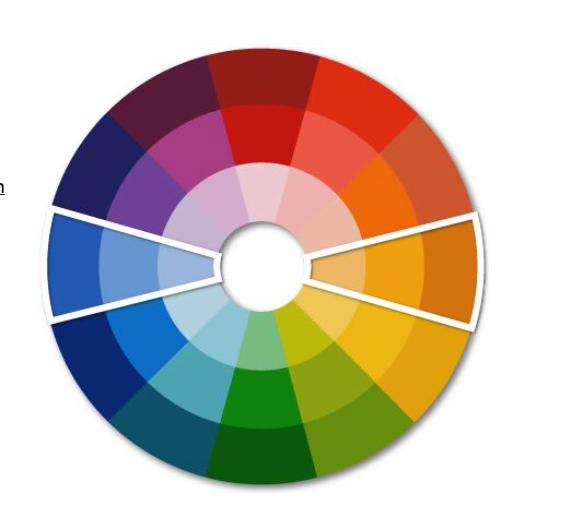
For a simple idea to fuse your space with elegance combined with drama, consider using complementary colors, or colors that sit opposite on a color wheel. Two opposite colors, one cool, one warm, create a high contrast dynamic purpose that catches the eye.
For a defined effect, consider using different shades or hues for every color family. There is no right or wrong way to use complementary colors once you define what the colors are. Start with a color you like best and its opposite and also consider the space you want to paint. What feeling or emotion do you want to evoke?
Bedrooms might do well with greens, grays, or blues while bathrooms and kitchens can go more bold by using such colors as yellows or reds.
To help you with understanding complementary colors, consider this information and visual.
Examples of complementary colors on the color wheel
- Red and Green
- Orange and Blue
- Yellow and Purple
Tips for Using Complementary Colors
When designing a room using complementary colors. consider not only walls, ceilings, and windows, but also furniture and accessories. Once you define the room or vision you have, you can use the color wheel to help you pick the color.
You might want to start with a smaller room, such as a hallway bath or mudroom if you are just beginning, but with some confidence and a bit of information, you can also go boldly to design a larger room such as a living room or bedroom.
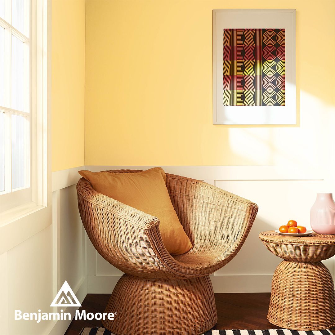
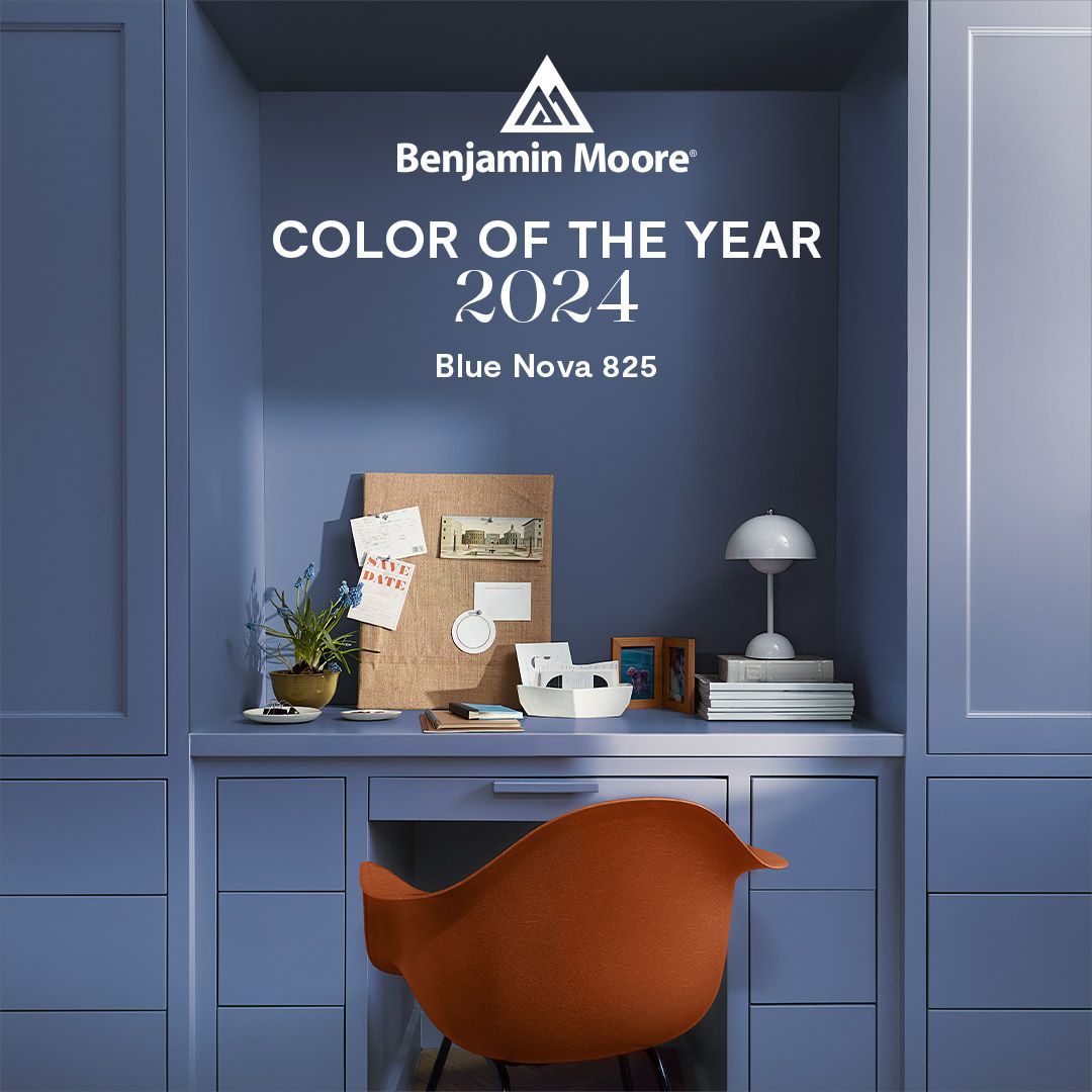
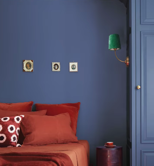
For example, say you want to create a visual statement in a bedroom using blue and its complementary color, orange.
Consider using Benjamin Moore Color of the Year 2024, Blue Nova 825. This chic blue hue with purple nuance come together to create passion and pleasure. Paint bedroom walls with Blue Nova 825 and add accent pillows, drapes, a bedspread, or throw rug in
Benjamin Moore Color Trend, Topaz 070 which is its complementary color.
Paint the ceiling, doors, and window sills in
White Dove OC-17 to complete the look!
To soften the depth of color, consider using a different shade of Topaz 070 such as Succulent Peach 068.
Don't be afraid to try using complementary colors. Make use of the color in your space as you see fit. For more advice on using complementary colors in your world, consider this messaging from
Benjamin Moore color expert, Ariana.

New Paragraph